Advisor Profile Redesign
Overview
As part of a company wide rebrand, the digital design team planned to update the primary app. One of the projects I led was redesigning the Advisor Profile Page.
The data showed that new users are increasing however, their conversion rates were very low. The biggest complaint was the confusing profile page. The roll-out strategy had to be carefully considered because the existing users were known to have trouble adjusting to changes in the app.
Project Plan
Customers use the profile page is used to learn about advisors, begin a reading, and schedule a reading.
Product Requirements
Maintain all of the elements and features on the original page
New design should be scalable for new upcoming features (favorites, video intro, Rewards Tier)
The ‘Core Users’ skew older and tend to get thrown off by changes to the interface
Design Strategy
Use a card sort to identify categories
Use native UI which is more familiar to Core Users
Make design updates in phases to acclimate Core Users to visual updates
Work with the marketing team to apply new branding to the UI
Use Cases
Core Users
Makes up 80% of the company revenue
40 - 60 years old
Mostly female
Adverse to changes
Will call customer service for answers
New Users
18-35 years old
Conversion rate of below 1%
Considers the UI outdated
Questions the security of the app
Finds alternatives with competitors
Card Sort
General Info
Photo
Video Greeting
Tools/Topics
Stats
Biography
Advisor Info
Status
Rating
Price
Testimonials
Primary Actions
Scheduling
CTAs
Secondary Actions
Favorites
Alerts
Tier Rewards
Final Design
Phase 1
Header: Advisor management features like ‘Favorite’ and ‘Alerts’ were added to the header. As new features are added to the page they can go into a meatball menu.
Profile Photo: In anticipation of video bios, a play button was added to the top left corner. A dark gradient was added behind the button for visibility. Special tags will also be overlayed.
Info Bar: The information important for to make purchasing decisions were placed near the top. Text was added to the ‘Status’ for accessibility and clarity. ‘Ratings’ were reformatted to save space. ‘Price’ can now display discounts.
Phase 2
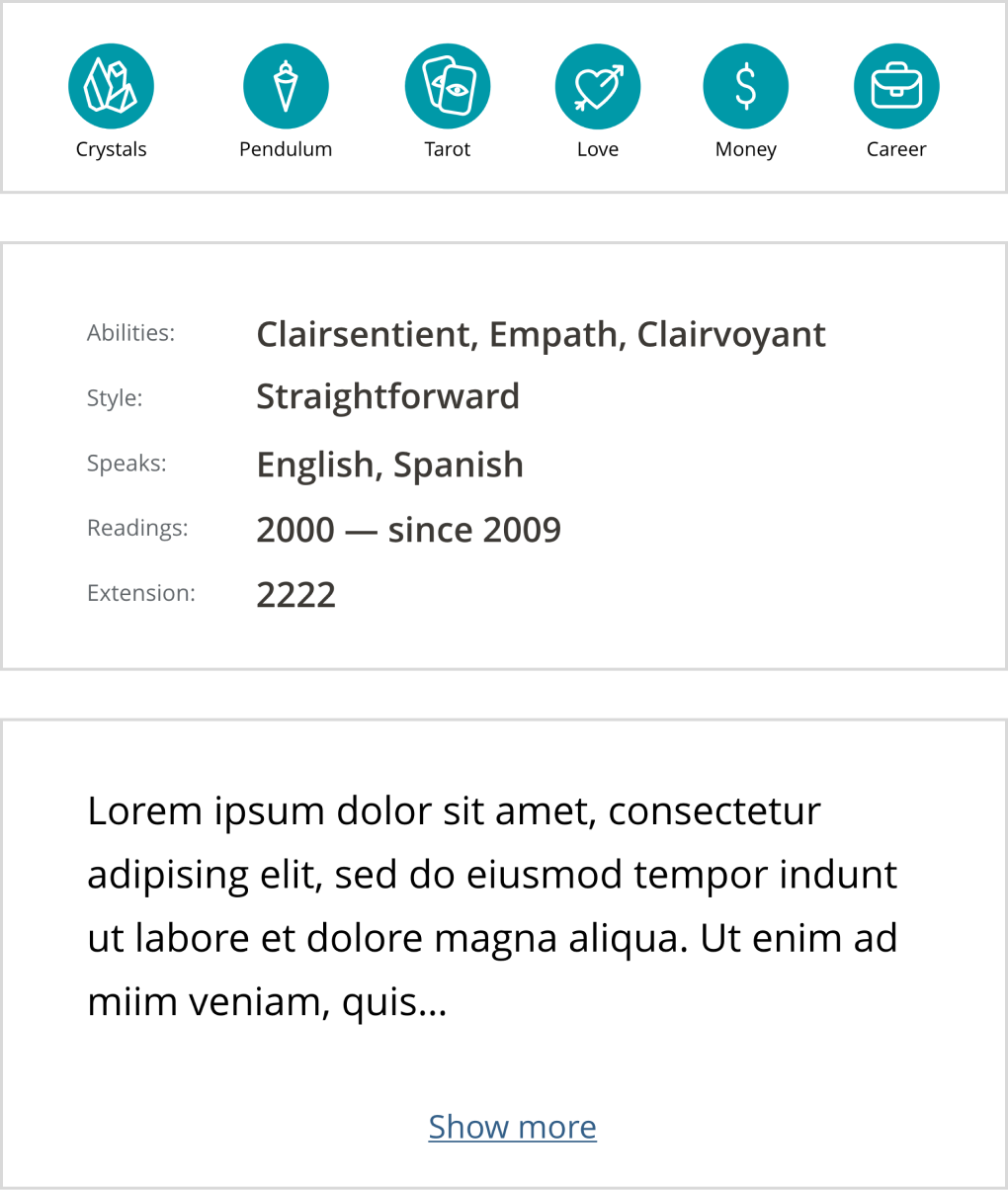
Tools/Topics: New icon branding was applied. Worked with the marketing team to resize some icons to accommodate for screen size.
Stats: The redesign improved the legibility of the text. The ‘Readings’ stat combined ‘number of readings’ and ‘year started’.
Bio: The bio was truncated to four lines with a ‘Show more’ option.
Phase 3
Schedule: The scheduling button was updated to the new style guide. Redesigning the UX for the schedule tool was considered out of scope.
Testimonials: The accordion will be defaulted to open and display up to 10 testimonials with a ‘Show more’ option at the bottom.
CTA Buttons: The buttons have an absolute position at the bottom of the page. The colors indicate when advisors are busy on a call and text was added for accessibility and clarity.
Queue Display Conflict
An employee from the customer service center expressed apprehension over making any changes to the queue display stating that the users really liked the component.
The design team felt that the UI would not fit with the new branding. Furthermore, we hypothesized that what users actually liked was the live feedback not the visual design.
The redesign of the component was paused and flagged for discovery in the future.
Reflections
Challenges
Coordinating between design teams in a different time zone caused some delays in communication.
Requirements came from multiple sources, which resulted in last minute changes.
Design approval was decentralized and any critique had equal weight.
Learnings
In an agile environment, timelines can be negotiated if delays occur during the process.
Maturing a design practice takes time and requires organizational buy in.
Make sure that the product scope is defined before taking on design work.
Thank You For Reading!


